What Were They Thinking!?
Top 10 Worst Video Game Character Makeovers of All Time!
There are a handful of gaming franchises that are timeless, but most video game characters have to evolve in order to stay relevant. Publishers and developers are always looking for ways to appeal to younger audiences and new demographics, but it can be difficult to do this if your characters were designed with a different generation of gamers in mind. If a publisher is trying to reach an older audience, they may be compelled to make their characters darker and edgier. If the goal is to reach teenage boys, they might decide to turn up the sex appeal. In trying to pander to new audiences, companies often lose sight of why their characters were so beloved in the first place. There’s nothing wrong with a little preventative maintenance, but there’s no need to fix something if it isn’t broken.
Examples: She-Ra (2018), Looney Tunes (2005), ThunderCats (2019)
10
Joanna Dark
Perfect Dark Series

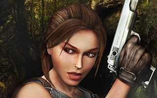
Joanna Dark is an English spy who specializes in industrial espionage and uncovers all sorts of conspiracies. The initial design of Joanna was not unlike Emma Peel of The Avengers, and she was portrayed as a feminist heroine who eschewed traditional “damsel in distress” portrayals of women. During the development of Perfect Dark Zero, Rare decided that Joanna should look like a woman who really wished she was still in high school. In all fairness, Perfect Dark Zero was technically a prequel so Joanna was supposed to look a little younger, but her streaked hair, exposed midriff, and excessive use of cosmetics made it hard to take her seriously. Joanna is an independent woman, but her new design made her seem like she was beholden to fashion trends. We were supposed to buy her as some sort of elite superspy, but the new Joanna looked like she would rather spend her time texting her BFFs and hanging out at the mall food court.
9
Guybrush Threepwood
Monkey Island Series

I have piled a lot of praise upon Guybrush Threepwood and the Monkey Island series, but I have never been overly fond of the art style that was adopted in Curse of Monkey Island. Guybrush was supposed to be a hapless hero, in all fairness, and the elongated features and slender frame helped accentuate this aspect of his character. For better or for worse, his swoopy hair and horse-like face would continue to define Guybrush in subsequent games, but LucasArts overdid it with the release of The Secret of Monkey Island: Special Edition in 2009. Guybrush was always known for his sarcastic sense of humor, but his Special Edition makeover had levels of smarm that were typically reserved for Dreamworks cartoons. Players had the option of switching between the original graphics and the enhanced visuals at their discretion, so it was impossible to ignore how awful Guybrush looked in comparison to his original design.
8
Dr. Eggman
Sonic the Hedgehog Series

What the fuck is this shit!? The 2006 reboot of Sonic the Hedgehog was a disaster in every sense of the word. It was full of glitches, marred by loading times, and weighed down by broken controls. The game featured one perplexing design choice after another, but I still can’t believe how badly they messed up Dr. Eggman. Sonic and his shitty friends were largely unchanged from previous installments, but Sega felt it was appropriate to redesign Eggman with a more “realistic” appearance. In a failed bit to make him seem more villainous, the comical side of his personality was reigned in. Sonic ’06 had a lot of things wrong with it, but I can’t imagine that anyone would think that Eggman’s new design would be well-received. The game featured an implied romance between Sonic and a human princess, but Eggman’s makeover is still the game’s most questionable design choice as far as I’m concerned.
7
Ebisumaru
Ganbare Goemon Series

Ebisumaru is Goemon’s long-standing partner and best friend. He’s known for his eccentric behavior and has developed a cult following as a result of his flamboyant personality. Ebisumaru fancies himself as a master ninja, but prefers prancing to sneaking. He also dresses up in ballerina outfits and has been known to strip in order to get store discounts. In one of the alternate endings to Ganbare Goemon 2, it was implied that Ebisumaru was actually a girl the entire time. This ending was not canon and was not meant to be taken seriously. Nevertheless, Konami revisited this concept in 2001 when they released a Shonen-inspired Goemon set in the future! All of the characters in the Japan-only Goemon: Shin Sedai Shumei were given makeovers that would ostensibly make them more appealing to younger audiences, and poor Ebisu got the worst of it. Reimagining Ebisumaru as a girl was completely unnecessary, but there wasn’t anything inherently wrong with it. Unfortunately, most of the goofy Japanese humor that made him so entertaining in the first place was eliminated with his Y chromosome.
6
The Prince
Prince of Persia Series

Have you ever seen a YouTube video where a clip is ruined by a crappy nu-metal soundtrack? That’s what playing Prince of Persia: Warrior Within feels like. The characters, story, music, and combat in The Sands of Time had an elegance that was all-but-forgotten in the sequel. Warrior Within had a darker tone, featured gory finishing moves, and boasted a guitar-driven soundtrack that included a couple of Godsmack songs for some reason. The Prince himself was a lot grittier as well. After manipulating time to erase his mistakes, the Prince fell into despair and was transformed into a brooding tough guy with no charisma. The Sands of Time depicted him as an easy-going adventurer that could be likened to Aladdin, but the Prince was so angry in the sequel that he could barely swing a sword without swearing. The Two Thrones allowed the series to end on a positive note and almost felt like an apology. The Prince found himself haunted by a manifestation of his own darkest attributes, but he separated himself from his rage and literally walked away from his angsty alter ego.
5
Maria Renard
Castlevania Series

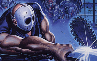
The Castlevania series has been around for three decades, so it’s not surprising that the franchise has experimented with different art styles. Some of these styles were more popular than others, but it’s safe to say the direction they took with Castlevania Judgment was completely unexpected. The concept of a Castlevania fighting game was met with shock and skepticism from the very beginning, and the derivative character designs felt completely out of place. This whole list could have been comprised entirely of characters from the game, but Maria Renard’s makeover was the most absurd. In Rondo of Blood, Maria insisted on helping the heroic Richter Belmont after being rescued. In Symphony of the Night, Maria was defined by her fierce independence and bravely ventured into Dracula’s castle by herself after Richter went missing. In Castlevania Judgment, she was an oblivious tween who used expressions like “Ohmigod” and wanted nothing more than for her breasts to grow. Her personality was played entirely for laughs, and she was basically a walking anime stereotype.
4
Dante
Devil May Cry Series

DMC: Devil May Cry is set in an alternate reality of the mainline Devil May Cry series and was developed by the British-based Ninja Theory. With a handful of exceptions, few developers would have been better-suited to make a Devil May Cry game than Ninja Theory. (Heavenly Sword was one of the best PlayStation 3 exclusives and Enslaved: Odyssey to the West was one of the most underrated games of its generation.) From its inception, DMC was intended to take the series in a new direction in an attempt to appeal to new demographics. While the original Dante was designed from a Japanese perspective, the new one was tailored for Western tastes. The anime tropes that Dante once adhered to were abandoned in favor of emo tropes. Dante dressed for a new generation, but the differences extended well beyond his hairstyle and clothing. The new Dante was still a wisecracking smartass, but he also came across as an angsty teen with an inflated ego and a wicked sense of entitlement. The original Dante could be pretty lame at times, but he was a total badass and always seemed to be in on the joke. The new Dante, in contrast, seems like he just wants attention.
3
The Dark Queen
Battletoads Series

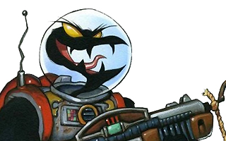
The main villain in the Battletoads series is one of gaming’s first femmes fatale and arguably the hottest girl of the 8-bit era. The scantily-clad Dark Queen had her mind set on galactic conquest, and she apparently wanted to look good doing it. To that end, she wore a leather dominatrix outfit that highlighted her shapely figure and toned legs. Most players never made it anywhere near her since they couldn’t get past the notorious Turbo Tunnel, but the Dark Queen made her appearance felt by showing up in cutscenes. Her sex appeal was ramped up further in Battletoads Arcade, where she was depicted with erect nipples and bouncy breasts. Sadly, Microsoft and Dlala Studios decided to completely change her style in the ill-fated 2020 Battletoads reboot. Her initial design was akin to a Golden Age comic book villainess, but the new version looked like a Kim Possible reject. (Seriously, she looks like the bastard love child of Shego and Dr. Drakken.) For some reason, the developers were actually proud of their design choices. The Dark Queen even references how she used to dress, and makes a snide comment directed at fans who aren’t offended by the female form. She was covered from the neck down and stripped of her femininity, and her personality was also dragged through the mud. The original Battletoads painted the Dark Queen as a powerful woman capable of world domination, but the reboot gave her an obnoxious sense of humor that had about as much subtlety as a Melissa McCarthy fart joke.
2
Nathan “Rad” Spencer
Bionic Commando Series

Rad Spencer (also known as Ladd Spencer) is an elite soldier that can be identified by his spikey red hair, bright green fatigues, and radical sunglasses. Of course, he’s more easily defined by his bionic arm that lets him swing around like Spider-Man. Bionic Commando was one of the best action games of the 1980s, and it ended with Rad Spencer shooting Hitler in the face! It doesn’t get much cooler than that. Leading up to the 2009 Bionic Commando reboot, one of the game’s developers explained that they “obviously” couldn’t continue to call their protagonist “Rad” Spencer and felt that “Nathan” Spencer would be a more appropriate name for the era. They made the right call. There was nothing rad about the ill-conceived reboot, and a generic name like Nathan was a much better fit for an unspectacular protagonist. Rad Spencer looked like he was ripped right out of a GI Joe cartoon while Nathan looked like he was pulled off stage at a Counting Crows concert. Which guy would you trust to fight for your freedom? The worst thing about Spencer’s makeover was how his bionic arm was now purported to have been made out of his dead wife. It’s as though Capcom wanted the reboot to fail.
1
Bomberman
Bomberman Series

Bomberman has undergone many transformations since making his debut on home computers in 1983. He was initially depicted as a little guy with a hat, but he’s best known for the lovable “White Bomber” design that he first adopted in the NES port of Bomberman. This version of Bomberman is defined by a large head, huge eyes, and a trademark antenna. It’s safe to say that this design resonated with gamers, as it was used in nearly 100 games on dozens of different gaming platforms. In a bizarre turn of events, someone decided that a makeover was needed for Bomberman: Act Zero in 2005. For reasons I will never understand, Bomberman was given an ill-advised “Iron Man meets Vectorman” makeover that supposedly would appeal to an older audience. Players were able to create their own characters in the game, but it was a fool’s errand since every single permutation ended up looking like total garbage. Bomberman: Act Zero was an embarrassment of a game, and its art style was universally panned by critics and consumers alike. Even the developers admitted that the game was a mistake. Of all the gritty reboots recognized on this list, none missed the mark more than Bomberman: Act Zero did.


Do you agree with this list? Let us know what you think by leaving a comment below. Your opinion matters!